HOSPITALITY
stand out in the hospitality space
We help restaurants, caterers, and event venues grow with marketing that brings in bookings and builds buzz. From stunning menus and websites to high-impact social media, we turn one-time guests into loyal fans.
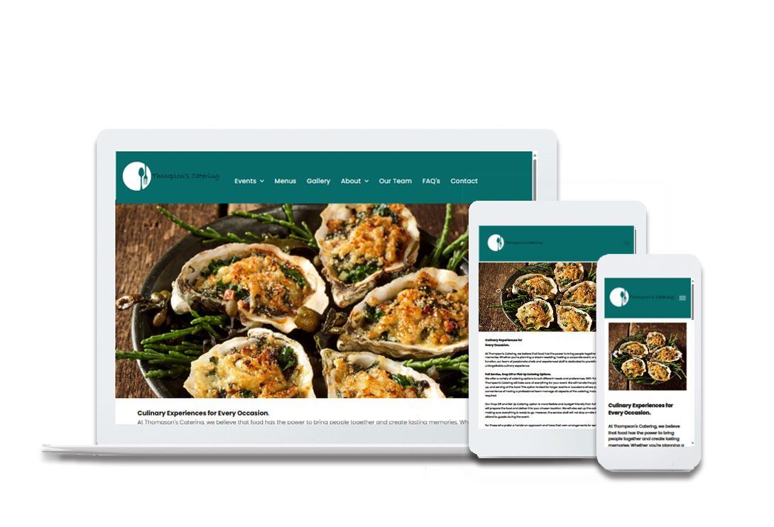
Ten Ten Marketing worked with Thompson’s Catering, a beloved Southern Maryland company known for its fresh seafood and down-home cooking. We designed a logo that honored their rich family heritage and culinary roots, then built a custom website that showcases their menus, services, and legacy of hospitality. The result: a brand presence as warm and welcoming as their food.
Logo Design
 View Solution
The Thompson's Catering logo intertwines a line drawing of a white plate with a fork & spoon. This symbolizes the artistry of their craft. At the client's request, a graceful script font graces their logo, adding a touch of sophistication.
Website
Thompson's Catering website is thoughtfully designed with the customer in mind. It offers an easy-to-navigate layout where visitors can effortlessly browse the catering menu, explore the services provided, and download the menu for convenience. The site also features a simple contact form for quick inquiries. Additionally, it includes a gallery showcasing photos from previous catering events, giving potential clients a visual taste of the company's work. The color palette, incorporating teal, white, and black, was specifically chosen to meet the client’s request, creating a clean and professional look that reflects their brand.
Project Highlights:
Ten Ten Marketing was brought on to help launch
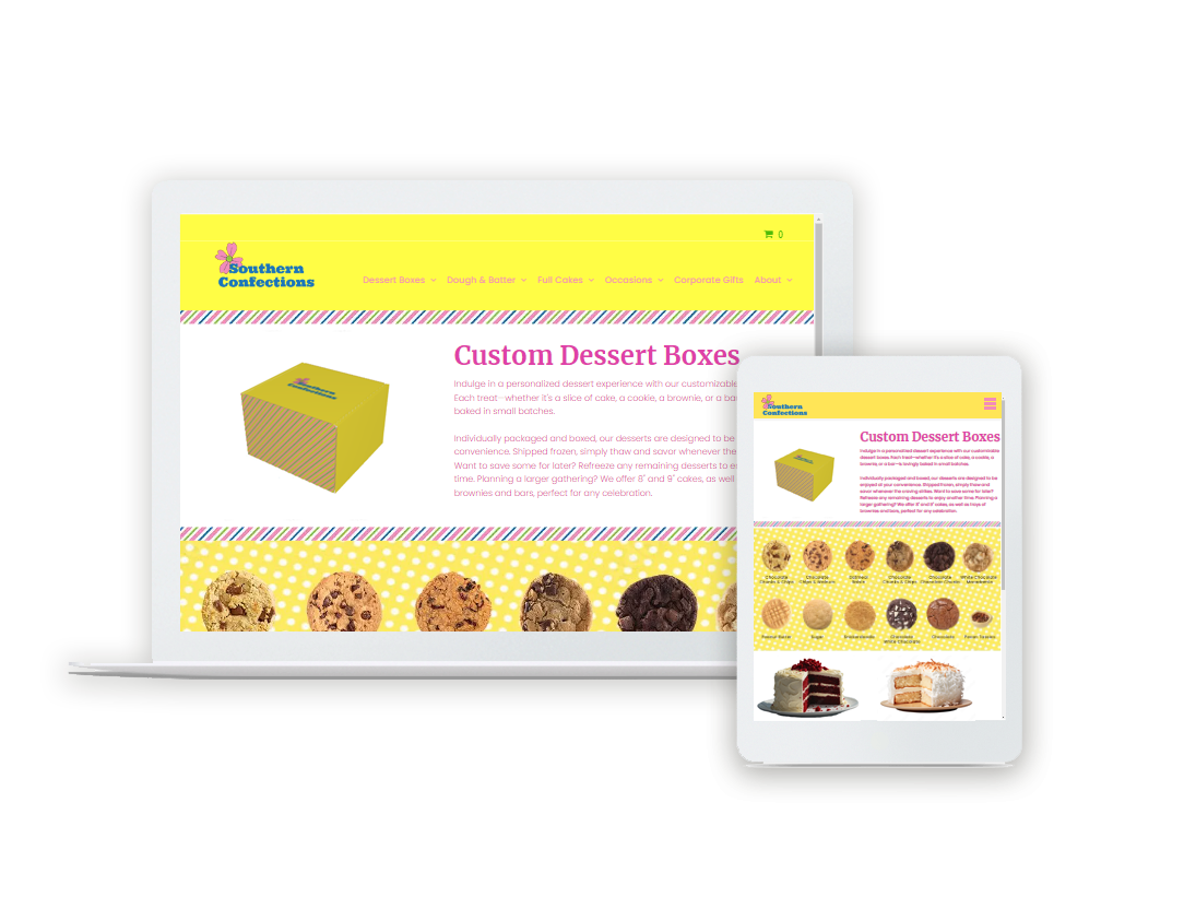
Southern Confections, a gourmet food and gift company known for its decadent cakes and irresistible southern tassies. Our team developed the full brand identity—from the company name and logo design to a vibrant, user-friendly website and cheerful packaging that delights at first glance. Every element was crafted to reflect Southern charm, homemade quality, and joyful gifting.
Brand Name
View SolutionThe name "Southern Confections" was chosen as the brand name because the owner is originally from Virginia and learned to bake from her mother, who baked traditional southern cuisine.
- The word "Southern" immediately evokes the rich culinary traditions of the American South, which is famous for its comforting, flavorful desserts like pecan tassies, pound cakes, and red velvet cake. Recipes have been passed down through generations, offering a connection to time-honored, homey baking.
- Southern desserts are often associated with warmth, hospitality, and family gatherings. The name "Southern Confections" taps into that sense of nostalgia and comfort, appealing to customers who crave a taste of home or want to share that experience with others through gifts.
- The word "Confections" conveys an air of sophistication and indulgence, aligning with the idea of gourmet, high-quality products. It suggests that the desserts are not only delicious but crafted with care and attention to detail, perfect for both personal enjoyment and gift-giving.
- The name appeals to regional pride, attracting both locals who want to support Southern businesses and non-Southerners who are intrigued by or have a love for Southern cuisine. It helps establish a strong brand identity rooted in the cultural richness of the South.
- "Southern Confections" is simple yet memorable. It rolls off the tongue easily and sticks in the mind, making it a great choice for branding and marketing. It also clearly communicates the company's specialty without needing further explanation.
- The name combines the heritage of Southern baking with the luxury and elegance of gourmet treats, making it a strong, appealing brand name.
Logo Design
 View Solution
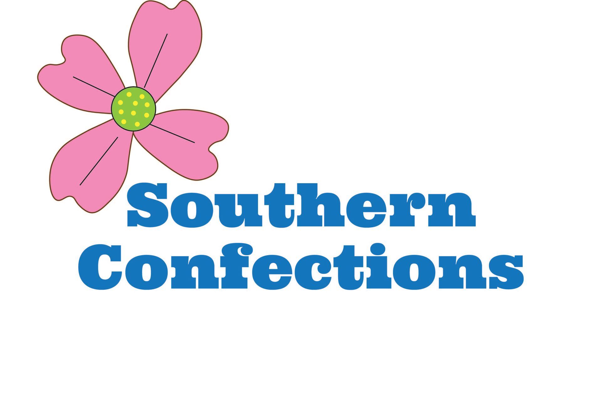
The use of the dogwood flower was utilized in the logo for "Southern Confections". The dogwood tree is the state flower of Virginia, where the owner is from.
- By incorporating this element, the logo pays homage to the owner's roots and highlights a symbol of pride and identity. This helps create a strong connection to the South and to Virginia in particular, which enhances the authenticity of the brand.
- The delicate pink petals of the dogwood flower convey beauty, grace, and elegance, aligning with the gourmet and gift-focused nature of the business. It also has a classic, natural aesthetic that appeals to customers looking for high-quality, artisanal products.
- The dogwood is often associated with purity, strength, and resilience, qualities that resonate with the Southern spirit and the care that goes into handmade, traditional Southern desserts. This adds emotional depth to the logo, creating a sense of warmth and sincerity.
- The colors used in the logo—blue (mountains), yellow (sun), and green (sprawling farms and grass)—complement the natural beauty of the dogwood flower, grounding the brand in the landscape of the South. These elements evoke images of the region’s picturesque scenery, appealing to customers' appreciation for natural and sustainable ingredients.
- The combination of pink, blue, yellow, and green creates a vibrant yet harmonious palette. Pink (the dogwood) adds a soft, welcoming touch, blue represents calm and serenity, yellow brings warmth and optimism, and green symbolizes growth and freshness. Together, these colors evoke the Southern landscape and create a visually appealing design that feels inviting and cheerful.
- The dogwood flower is a distinct and memorable visual symbol that sets "Southern Confections" apart from other gourmet food brands. It is unique enough to stand out while being deeply meaningful to both the owner and the brand’s Southern identity.
- By incorporating the dogwood flower and these specific colors, the logo reflects the company’s Southern roots, natural beauty, and dedication to quality, making it an excellent representation of "Southern Confections."
Packaging Design
VIEW SOLUTIONThe packaging design for "Southern Confections" is thoughtfully crafted to evoke happiness and joy when a customer receives a gourmet food gift. It incorporates the brand’s signature colors, with a special emphasis on yellow to convey warmth, optimism, and sunshine. At the bottom of each box, playful circles either feature the elegant dogwood logo or uplifting, inspirational words, adding a personal touch that feels both thoughtful and cheerful. The overall design is meant to create a sense of delight and make the recipient smile, enhancing the experience of receiving a special, handcrafted Southern treat.
Website
View SolutionThe website for "Southern Confections" plays a key role in driving brand awareness while staying true to the values and standards reflected in the company’s logo and color palette.
- Every element of the website has been designed to align with the warmth and charm that the brand conveys, ensuring consistency in its visual identity.
- The use of the logo’s colors—pink (dogwood flower), blue (mountains), yellow (sun), and green (farms and grass)—is thoughtfully integrated into the website, creating a cohesive experience for visitors. These colors are not only aesthetically pleasing but also evoke feelings of warmth, happiness, and connection to Southern roots.
- Whimsy and sophistication are carefully balanced throughout the website's design. The layout is clean and elegant, reflecting the premium quality of the gourmet food products, while playful touches such as soft, polka dot graphics and delightful multi-colored stripes add a whimsical feel. This balance allows the website to feel approachable and inviting while maintaining a sense of luxury, which appeals to both casual visitors and customers seeking high-end gifts.
- Ultimately, the website is designed with the same goal as the brand’s packaging—to make the consumer smile. From the vibrant yet calming color scheme to the thoughtful design elements, every aspect of the website invites the visitor into a joyful, heartwarming experience that mirrors the delight of receiving a gourmet gift from "Southern Confections."
- It enhances brand loyalty by creating an emotional connection, ensuring that customers associate the brand with happiness, elegance, and a touch of Southern hospitality.

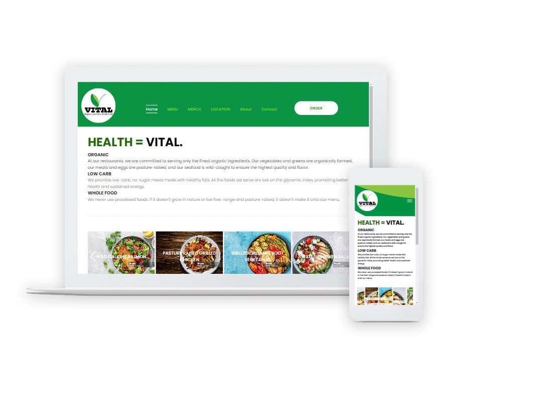
Ten Ten Marketing partnered to launch Vital, a fast-paced, whole food restaurant concept designed for the health-conscious consumer on the go. We helped bring the brand to life—starting with the name, mission statement, and target audience, then developing cohesive branding that included the logo, taglines, and vibrant imagery. From sustainable packaging design to a streamlined website, every detail reflected Vital’s commitment to clean, nutrient-dense meals made with organic vegetables, pasture-raised meats, and low-carb, no sugar added ingredients—all delivered with speedy service and style.
Brand Name
The word "Vital" carries strong connotations that align perfectly with the restaurant's core values of health and wellness.
- The definition of the word "vital" means "absolutely necessary or important".
- The word "Vital" suggests that the food served at this restaurant is not just a supplement or an extra, but something essential for one’s well-being.
- It implies that consuming their food is crucial for maintaining or improving health, much like vitamins, minerals, and nutrients are indispensable for the body.
- Essential: "Vital" emphasizes that healthy food provides fundamental nutrients or benefits that the body needs to function at its best.
- It positions the restaurant and its food as a key component of a healthy lifestyle, one that people cannot afford to skip.
In short, naming the restaurant "Vital" implies that it is indispensable for maintaining life and health, making it a powerful, evocative brand name for healthy food choices.
Target Audience
Primary Audience:
- Mid-life professionals (35-54) and individuals 55+ in urban areas looking for healthy meals (low carb, grass fed, pasture raised, quick serve, but healthy meals).
- High household incomes.
- Office workers seeking a high-quality alternative to typical fast food or non-organic, so called "healthy" foods.
Demographics:
- Ages 35-54
- Middle to upper-income,
- Health-conscious
- Time-strapped, tech-savvy individuals.
Locations:
- Urban areas near office parks and transportation hubs.
- Suburban areas in high traffic shopping centers
Logo Design
 VIEW SOLUTION
The Vital Restaurant logo features a stylized leaf and stem in two shades of green.
The use of the color green (in two shades) has an association with Nature and Freshness.
- Green is universally associated with nature, growth, and health. Using two shades of green enhances this connection, symbolizing the fresh, organic ingredients and natural approach the restaurant takes toward food.
- The two shades creates depth and visual Interest. A single shade of green can appear flat, but using two different tones adds depth and dimension to the logo. This creates a more visually engaging design that can capture attention and leave a lasting impression.
- The logo conveys variety and balance. The contrast between lighter and darker green subtly communicates balance, diversity, and harmony in the restaurant's food offerings. It suggests a rich, varied menu filled with healthy choices, appealing to customers who seek both nutrition and taste.
- Green is also associated with sustainability and vitality. Using two shades represents different aspects of a healthy lifestyle—energy, vitality, sustainability—conveying a holistic approach to health.
The two shades of green offer versatility in design, symbolism, and aesthetics, making them a strong choice for this health-focused restaurant brand.
The leaf & stem in the Logo combine to form a symbolic "V" which creates instant Brand Recognition.
- A "V"-shaped symbol makes it easy for customers to associate the logo with the name of the business right away. This immediate recognition strengthens brand identity and helps people remember the business more easily.
- The shape of the logo matching the first letter of the name creates a harmonious and cohesive brand image. This consistency reinforces the brand in people's minds, making the business more memorable and visually appealing.
- The "V" shape is versatile and is stylized using clean lines, curves, and abstract elements—keeping the logo simple and recognizable.
- The "V" shape often symbolizes concepts like victory, vitality, and forward motion, which align well with positive attributes for a business, especially one in health or wellness.
- It can represent success, energy, or the idea of thriving, reinforcing the values the restaurant wants to communicate.
- The "V"-shaped logo is simple and minimalist, appealing to modern design trends that favor clean, straightforward aesthetics. This simplicity can makes the logo more versatile across various platforms (e.g., signage, digital, packaging) while still being effective.
- Using the symbolic "V" in the logo connects the visual identity to the business name, making it memorable and meaningful, while offering design flexibility and an opportunity to reinforce positive brand values.
The tagline "Organic, Low Carb, Whole Food" strengthens the "Vital" brand by reinforcing its focus on essential, health-promoting nutrition in a way that is clear, targeted, and appealing to modern health-conscious consumers.
- The word "Vital" conveys the idea of something essential for life and well-being. The tagline emphasizes that the products offered are crucial for health by being organic (natural and free from harmful chemicals), low-carb (beneficial for weight management and metabolic health), and whole foods (nutritionally complete and unprocessed). These attributes reinforce the idea of "vital" nutrition that supports overall wellness.
- The tagline is straightforward and immediately tells customers what they can expect from the brand. Each word highlights a specific aspect of healthy eating, making the value proposition of the brand clear. This concise, no-nonsense messaging resonates well with health-conscious consumers looking for specific benefits in their diet.
- The combination of "organic," "low carb," and "whole food" speaks directly to the needs and preferences of people who prioritize natural, clean eating. These consumers often seek products that promote sustainable health benefits, and the tagline reinforces that Vital is a brand they can trust to meet those needs.
- By focusing on these three key health trends—organic, low-carb, and whole food—the tagline positions Vital as a leader in the healthy eating space. It suggests that the brand is committed to providing the best, most health-promoting foods, which builds credibility and trust among customers.
- Many people adopt specific dietary lifestyles such as keto, paleo, or organic-focused diets. The tagline appeals to various groups who value not only the quality of ingredients but also the nutritional benefits. This broadens the brand's appeal and makes it more inclusive.
Packaging Design
VIEW SOLUTIONWe made the decision to use compostable, disposable packaging for the Vital Brand. This is rooted in a commitment to sustainability and environmental responsibility.
- By choosing packaging that breaks down naturally and leaves a minimal ecological footprint, the restaurant actively reduces its contribution to landfill waste. This aligns with the growing consumer demand for eco-friendly practices in the food industry, showing that Vital values not only the quality of its food but also its impact on the planet.
- Compostable packaging also demonstrates the restaurant’s dedication to the well-being of its community. Customers can enjoy their meals knowing that the packaging is non-toxic and safe for the environment. It reflects a forward-thinking approach, enhancing the restaurant’s brand image as a responsible, eco-conscious business that cares about the future.
- This choice aligns with the modern dining ethos where sustainability is not just a trend but a standard for responsible companies.
Merchandise
VIEW SOLUTIONWe crafted the uniform color scheme to complement the earthy, organic vibe of Vital Restaurant, striking a balance between modern and casual. Staff wear black polo shirts with the logo on the front and the tagline "Health = Vital" on the back, creating a sleek and professional look. Paired with brown khakis and a matching hat featuring the logo, the uniform reflects the restaurant's clean, natural aesthetic while maintaining a relaxed, approachable style.
Website
VIEW SOLUTIONThe website perfectly reflects Vital's overall brand image, using the same cohesive color scheme to maintain consistency. Designed with Vital’s customers in mind, it is user-friendly and makes ordering food simple and convenient. Visitors can easily find restaurant locations and have the option to order online for delivery or pickup, ensuring a seamless and enjoyable experience from browsing to checkout.
Interior Design Board
VIEW SOLUTIONThe interior design features whitewashed brick walls, with a striking green accent wall located near the staff kiosk. Bamboo dining chairs and tables, paired with a reclaimed wood floor, create a natural, organic feel. The logo is prominently displayed, reinforcing the brand identity, and tech-savvy customers can easily order at self-service kiosks, while others have the option to order through staff at the kiosk counter. Subtle pops of black are incorporated throughout the space, adding a modern touch. The overall atmosphere blends sophistication with earthy elements, creating a warm and contemporary dining environment.
Let’s talk about your project
We can't wait to hear how we can assist you in achieving your goals.